Tsuneo Suzuki, Professor, Faculty of Law
Understanding the Relationship Between “Colors” and Humans Through Diverse Disciplines from Science to History
There are “colors” all around us. However, it is not always the case that the color you see is the same as what other people see. Professor Tsuneo Suzuki has studied this physical phenomena from various viewpoints—physiological, sensory, psychological, as well as cultural, and historical—in order to understand the relationship between human and colors. The research is applied widely in our society from product development to universal design.
*The job title and other details were up-to-date at the time of publication.
Tsuneo Suzuki
Tsuneo Suzuki graduated in 1973 from the Faculty of Letters at Keio University. In 1977, he received a master’s degree from Keio Graduate School of Human Relations, and in 2004, acquired his doctoral degree. In 1990, he was appointed Assistant Professor at Keio University Faculty of Law, subsequently becoming Associate Professor, and currently Professor at the same faculty. Before his appointment at the university, he worked at a Shiseido laboratory studying skin color, as well as at a Fuji Film laboratory researching color reproduction and evaluation for photographs and films. He is also a treasurer at the Color Science Association of Japan. His main publications include Encyclopedia of Color Science (University of Tokyo Press) and Color Science (Joint Authorship, Asakura Publishing).
The Wavelength of Colors does not Necessarily Determine How We Perceive Colors
──First of all, what is the study of color psychology?
Psychology is the study and observation of mental function and behavior within various contexts including scientific, social, and cultural. Within psychology, color psychology focuses on how humans perceive or see colors. Color is defined as light waves in physics, and color can also be the visual experience through human sensory perception. Furthermore, there is the linguistic aspect of color, which is connected to human experience and history. In other words, even if the color is, in a physical sense, the same, it does not mean we perceive the color in the same way, and many observations can be made in terms of how color is described through language.
Before I started teaching at university, I worked for Shiseido and Fuji Film, studying skin color, how color is reproduced in photos and prints, as well as evaluating image quality. Colors are closely connected to our minds as well as our daily lives.
──Can you please explain in more detail what you mean by “how colors are perceived”?
First of all, we should understand “what color is.” Say, for example, there is a “red” apple in front of you. This apple is not exactly a red object; the eye perceives the object to be red when part of the electromagnetic radiation or light that falls on the object is bounced off the object. The sun emits electromagnetic radiation, but light that is visible to the human eye has a wavelength ranging from 380nm to 780nm, or to put it simply, visible light refers to the colors of the rainbow that are refracted from a prism. Material objects appear to have a certain color since they are able to selectively absorb and reflect certain wavelengths of visible light. This is “color” as defined through the physical property of light.
However, it is not possible for humans to calculate the physical property data of light in their head and translate that into color. Humans have three types of visual cells, each having a different sensitivity to light wavelengths: one is most sensitive to light in the blue part of the spectrum with shorter wavelength; another is most sensitive to the red part of the spectrum with longer wavelength; and the other is most sensitive to the green part of the spectrum with middle wavelength. These cells process light that reaches the eye effectively, and sends the information to the brain through optic nerves. So, just as there are three primary colors of light (red, green, and blue), the brain gathers corresponding data and perceives color. This is the explanation of what “color” is from a physiological perspective.
Why does blue curry seem unappetizing? Much of how human psychology is influenced by color is yet unknown
──What is the relationship between mind and color?
For instance, for a period of time, people talked about the color blue as having a calming effect on the mind. There have been attempts to test this theory, such as making running tracks blue to aid concentration, or installing blue LED lights at railway stations to prevent suicides, but the effects have not been conclusive.
However it is not uncommon for humans to feel warmth from red, and feel refreshed by green. This is a psychological effect associated with memory and experience. For example, by using warm colors for the room lighting you can turn the room heater temperature settings lower by one or two degrees. And, even if the taste is the same, if the color of curry is blue, it is not as appetizing. Color is not able to raise your body temperature physiologically, or exert a direct effect on reducing crime rate, but it is understood that color does affect moods.
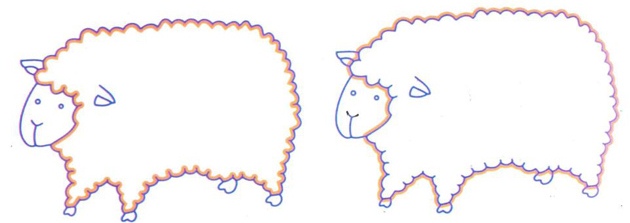
Additionally, even if the color is physically identical, they may appear different depending on your environment. Do the sheep in the illustration above look the same to you? Both sheep are the same white, but the position of the orange outline makes them appear different.
In this regard, the mechanism behind human psychology and the perception of color is an area of research that needs to be explored further.
──How is the study of color applied in real life?
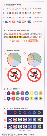
There are different levels of color vision; some people were born with abnormal visual cells, or with color vision deficiency. In Japan 5% of males and 0.25% of females have this condition. One form of this condition is not being able to differentiate red and green. This means that red and green for on and off switches is hard to differentiate, and it is difficult for them to tell if a piece of meat is browning when being cooked. Similar problems occur when trying to differentiate train lines on train route maps, or looking at printed design. In the field of color studies, researchers are working on universal designs that are also friendly to people with these conditions. This has been applied in various real-life contexts, such as differentiating diagrams by pattern rather than color, changing the thickness or the shape of lines, or including explanations in texts.
In terms of product development, it is much easier to change the color of the product than it is to change the shape of the product. That is why mobile phones and automobiles come in many colorful colors. By looking at past trends and through market research, it is actually possible to predict what color will sell more. However, products attract more attention and sell better when arranged in a wide array of colors than if displayed in any one color alone. I am also a board member of Japan Fashion Color Association (JAFCA). When I suggest what color will become the new trend, I also have to be able to explain why. This is how the science of color is applied in many different facets of our lives.
Historical Interpretation of Why the Color Purple has been Associated with Nobility
──What are we trying to understand through color psychology?
We are trying to understand the effects of color, and its connection to language. For example, in Japan, people commonly referred to the color of their skin as “肌色 (skin color),” but now they like to use the words pale pink or pale orange. These are colors that Japanese people see as the ideal skin color, but restricting language that expresses skin color can also lead to racial discrimination. Furthermore, the skin color of Japanese is not exactly pale pink. Try finding a color on a color chart that best matches your skin, and you will realize how dark and dull that color is. Similarly, you may imagine a vivid sky blue in reference to “the color of the sky,” but in reality, the color of the sky is not that beautiful. In this way, humans have a tendency to aestheticize color. The skin color of someone you admire, or a sunny blue sky looks more beautiful in your mind than in reality.
In the Japanese language, the use of the words blue and green are muddled. Ao-shingo (blue traffic lights), ao-kabi (blue mould), and ao-ringo (blue apple) are common expressions, but these things are actually closer to green. What is the reason for this? Looking through the Kojiki, the Japanese language in ancient times appears to have included the four words red, blue, white and black to express colors, but not yellow and green. With many languages in the world, blue and green are quite often used with no proper distinction. The fact that the color blue hardly exists in the natural world is considered to be the reason for this. The sky and ocean are not “completely blue,” and blue flowers are actually closer to purple. Since blue has the shortest wavelength in the color spectrum, it absorbs ultraviolet light. Since ultraviolet light is harmful to living things, living things cannot survive if they are blue.
And, we believe the fact that it does not exist in nature is precisely the reason humans have prized the color blue. Beautiful blue hues were created artificially, such as the Egyptian blue in Egypt and the Han blue in China.
──What is your current research?
I am looking at the colors of the crowns in The Twelve Level Cap and Rank System (the first system in Japan to rank officials in twelve levels established in 603), and why purple was considered the most noble color. The colors in the ranking system is said to have originated from the Chinese Yin Yang and the Five Elements theory. However, the five colors in this theory include red, blue, white, and black, which were also used in Japan, with the addition of yellow, and it does not include purple. The wall paintings of mythical Chinese beasts that guard the Kitora tomb in Asuka village feature a yellow dragon in the center surrounded by an azure dragon, red phoenix, white tiger, and black tortoise. However, the Chinese Analects mentions the color purple. In the Shān Hăi Jīng, god is represented by the color purple, and Korea’s Samguk Yusa mentions that the emperor of Korea’s first kingdom was born from a purple egg.
Meanwhile, the first recorded use of purple dye was “royal purple” made in Phoenicia from shells during the Roman period, and was considered extremely valuable. My theory is that people in Asia somehow found about purple being the color of nobility in Rome, and they started to make purple dye using plants (lithospermum erythrorhizon) instead of shells. In this way, it is possible to trace language and history through the study of color.
Rather than specializing in one field, an interdisciplinary approach to research combining multiple disciplines is needed in the present age. Color psychology is also an endlessly interesting field in which one can start connecting the dots through the exchange of information with researchers from diverse disciplines.
*This article appeared in "Kenkyu Saizensen" (May 8, 2014) of Keio University Japanese Website.
*Position titles, etc., are those at the time of the interview.